Using Python and Pandas to check HTTP load distribution
May 30, 2016
Since writing my previous post on using standard Unix shell tools to analyse a HTTP access log, I've been thinking about how to do this with more standard data analysis tools. Using Pandas and Matplotlib, which are the main Python data libraries, you can get a bit more fine-grained control, and view the results graphically.
As a reminder, the question I'm trying to answer is "given this HTTP access log file, are there any time periods where my request rate is much higher than normal?".
First, I'll import the relevant libraries:
#!/usr/bin/python3
import pandas as pd
from datetime import datetime
import matplotlib.pyplot as plt
Then parse the data out of the file into a Pandas Series data structure, indexed by timestamp (i.e. a time series):
def mysum(list):
    return 0 if len(list) == 0 else sum(list)

def parse_data(filename):
    events = {}

    with open(filename) as f:
        # Example line:
        # 14-04-2016 11:01:28.737 UTC 200 GET /url_a 0.000863 seconds
        for l in f.readlines():
            date, time, tz, status, method, path, latency, _ = l.split()
            dt = datetime.strptime(date + " " + time, "%d-%m-%Y %H:%M:%S.%f")
            # Build up a dictionary of timestamp -> number of events happening at that time
            events[dt] = 1

    time_series = pd.Series(events)

    # Count how many events were in each 50ms period
    time_series = time_series.resample('50L', how=mysum)
    return time_series


ts = parse_data('access.log')
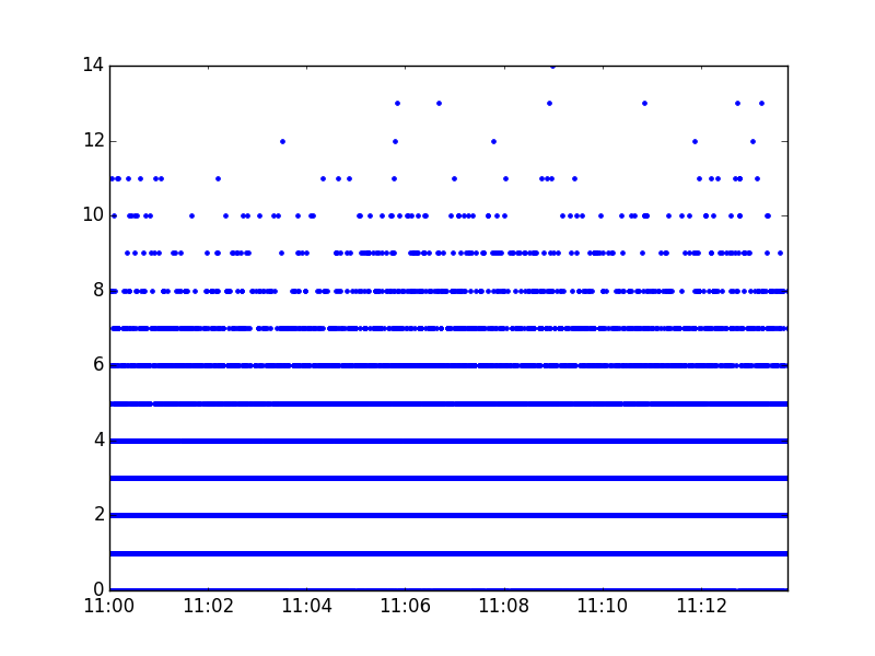
This gives me a time series, indexed by the start of each 50ms window, containing the number of HTTP requests in that time window. An example snippet of it looks like this:
(Timestamp('2016-04-14 11:13:39.600000', offset='50L'), 1)
(Timestamp('2016-04-14 11:13:39.650000', offset='50L'), 2)
(Timestamp('2016-04-14 11:13:39.700000', offset='50L'), 5)
(Timestamp('2016-04-14 11:13:39.750000', offset='50L'), 1)
(Timestamp('2016-04-14 11:13:39.800000', offset='50L'), 8)
Unlike with Unix shell tools, which could only group things into 100ms or 10ms buckets, Python/Pandas allows us to sample at any frequency we want.
We can then graph that time series in a few lines of code:
def display_graph(time_series):
    fig = plt.figure()
    p = time_series.plot(style=".")
    fig.add_subplot(p)
    plt.show()
which produces this graph:
If we want a more methodical approach than just eyeballing the graph, Pandas maskes it easy to do outlier detection - here, I'm using Tukey's range test, and printing out any data which it views as 'far out'.
q1 = ts.quantile(0.25)
q3 = ts.quantile(0.75)

outlier_boundary = q3 + (3*(q3-q1))
print(ts[ts >= outlier_boundary])
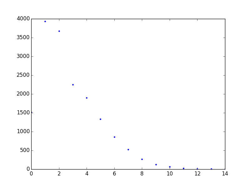
You can also do more manipulation on this data structure - for example, the graph above makes it difficult to tell how the events are distributed at the lower levels (e.g. whether more 50ms time intervals have one event in than have two events in), because there are so many of them. But you can just create a new Pandas data structure to answer the question "how many time intervals have N events in?", and print or graph that:
buckets_by_number_of_events = collections.defaultdict(lambda: 0)
for value in ts:
    buckets_by_number_of_events[value] += 1

display_graph(pd.Series(buckets_by_number_of_events))
print(pd.Series(buckets_by_number_of_events))
which produces the following output, showing that 7,000+ 50ms time windows have 1 or 2 events in, but only 12 have 12 or more:
0     1520
1     3933
2     3678
3     2254
4     1898
5     1337
6      855
7      528
8      270
9      129
10      64
11      26
12       5
13       6
14       1
I've put the code from this post on Github, at https://github.com/rkday/pandas-clustering-analysis.